Your shopping cart is empty!
Will Off-White Cabinets Work With the Countertops You Already Have?
Posted By: Eva Times Read: 4
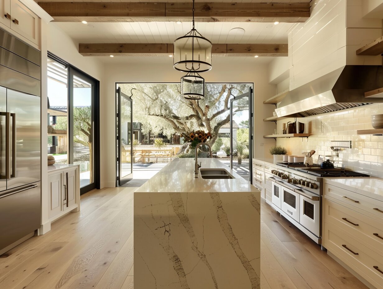
Replacing cabinets doesn't mean tearing out everything else. If your countertops are still in good shape, keeping them protects a big part of the budget and spares you weeks of disruption. New off-white cabinets can still change how the whole room feels. What most people get stuck on is whether the two will look right together.
In most kitchens, they will. Whether the pairing works has less to do with light versus dark and more to do with undertones, pattern, and the finishes around both surfaces. Our RTA cabinets come in several off-white shades, including warm white, ivory, cream, and vanilla, so you can choose a shade to suit the countertop you have instead of the other way around.
Start With the Countertop, Not the Cabinet
Your countertop is the fixed point, so read it first. Stand back and look for its dominant undertone. In granite, that usually comes from the background color and the larger flecks. In quartz and marble-look surfaces, it comes from the veining. Most countertops lean warm (gold, tan, brown, beige), cool (gray, blue-gray, true black), or sit close to neutral.
Off-white cabinets lean too. Some carry a little yellow or peach, some a little gray, and a few are close to neutral. You want a shade that leans the same direction as your countertop. When the two lean opposite ways, one of them nearly always ends up looking dingy next to the other.
If you can't tell which way your countertop leans, hold a sheet of plain printer paper flat against it. Next to bright white, an undertone that was hard to name usually becomes obvious.
Off-White Shades for Warm Countertops
If your countertop is beige, tan, brown, or cream, or has gold running through it, stay on the warm side. Ivory, cream, and vanilla pick up those tones, so the room looks finished instead of patched together. A stark, cool white tends to make warm stone look muddy and a little tired.
Watch that you don't go too yellow, though. If the countertop is already very golden, a strongly yellow cream can turn the room into one beige wash. A warm white with only a slight yellow cast keeps enough separation between the surfaces.
Off-White Cabinets With Gray Countertops
Gray works well with off-white once you know which gray you have. Blue-gray and cool gray stone suit a neutral off-white or one with a faint gray cast. Warmer grays, the kind that look slightly brown or taupe in daylight, sit better beside creamier finishes.
Matching Off-White Cabinets to Common Countertops
Use this as a shortlist of shades to sample, not a final answer. Lighting and the rest of the room will still shift the result.
| Your Countertop | Off-White Shades to Sample | Hardware That Suits It |
|---|---|---|
| Tan or brown speckled granite (Santa Cecilia, Venetian Gold, Baltic Brown) | Cream, ivory, vanilla | Brass, oil-rubbed bronze |
| Black granite or soapstone-look quartz | Almost any; warm white softens the contrast | Matte black, brass |
| White quartz with gray veining (Carrara look) | Neutral off-white or one with a slight gray cast | Brushed or polished nickel |
| White quartz with gold veining (Calacatta gold look) | Warm white, ivory | Brass |
| Gray granite with blue or silver flecks | Neutral or slightly cool off-white | Brushed nickel, chrome |
| Butcher block | Cream, warm white | Brass, matte black |
| Beige or tan laminate | Warm white, cream | Brushed nickel, brass |
| Gray laminate | Neutral off-white | Brushed nickel, matte black |
What If Your Granite Is Busy?
Heavily speckled granite went into a lot of kitchens in the late 1990s and 2000s, and plenty of it is still in excellent condition. The way to make it work is to let it be the only busy surface in the room.
Pick a quiet off-white that matches the lightest background tone in the stone, and choose a simple door style. Keep the backsplash plain, too: a solid subway tile or a smooth slab works far better than mosaic or patterned tile. When the granite is the only pattern, it looks like a choice rather than something you inherited.
Should Cabinets Be Lighter or Darker Than the Countertop?
There's no fixed rule. It comes down to the mood you want and how heavy your existing materials look.
Dark granite or a soapstone-look surface anchors light cabinets and gives you strong contrast. A mid-tone countertop makes a gentler step between the two surfaces. A light countertop with off-white cabinets gives an airy, layered look, provided the two aren't nearly identical.
That last pairing is where kitchens most often go wrong. When the cabinets and countertop are close in color but their undertones fight, the room looks like a mismatch rather than a plan. Try the squint test: stand in the doorway and squint. If the cabinets and countertop blur into one flat block, add separation with darker hardware or a backsplash that sits between them in tone.
The Other Finishes That Change the Result
The countertop is only part of the picture. Backsplash, flooring, wall paint, appliances, and hardware all shift how an off-white reads.
If your countertop has bold veining or heavy speckle, keep the backsplash simple. A quiet countertop leaves room for textured or handmade tile.
Hardware ties the palette together. Brass flatters ivory and cream, brushed nickel suits neutral and cooler off-whites, and matte black adds definition against any light cabinet. Wherever you can, match the faucet finish to the hardware so the metals look planned.
How Door Style Changes the Color
The same off-white looks different depending on the door. A Shaker door's recessed center panel creates a thin shadow line around the frame, so the color reads a touch deeper and the door has more definition. Slim Shaker frames are narrower, which means less shadow and a cleaner, more modern look.
Flat slab doors show the color as one unbroken surface, so any undertone clash with the countertop is easier to spot. Raised-panel traditional doors carry the most shadow and suit warmer shades like cream and ivory. CabinetDIY offers Shaker, modern, farmhouse, and other door styles across its finishes, so if you're torn between two shades, order the samples in the door style you actually plan to use.
How to Test a Cabinet Color Before You Order
- Stand sample doors directly against the countertop and backsplash, not across the room.
- Look at them in the morning, mid-afternoon, and at night under your own bulbs. Daylight, warm bulbs, and cool LEDs all change an off-white, and a shade that looks creamy at noon can go flat after dark.
- Keep the floor and wall color in view while you judge.
- Photograph the samples from the same spot at each time of day so you can compare them side by side.
- Leave them in place for a few days before you decide.
You're not hunting for an exact match. You want undertones that agree and finishes that balance.
Frequently Asked Questions
Do cream cabinets go with brown granite?
Yes. Cream and ivory pick up the warm tones in brown and tan granite, which is why the pairing is so common. Skip stark, cool whites, which tend to make brown stone look dull.
What color cabinets go with black granite?
Almost any off-white. True black granite has very little undertone to clash with. Warm whites soften the contrast, and crisper whites sharpen it.
Should cabinets match the countertop exactly?
No. A near-match usually looks like a mistake. Aim for undertones that agree and enough contrast that each surface stands on its own.
Can I keep laminate countertops with new cabinets?
Yes, if the laminate is in good condition and its color agrees with the cabinet shade. Beige and tan laminates suit warm white and cream, while gray laminates suit neutral off-whites.
What hardware goes with off-white cabinets?
Brass for warm shades, brushed or polished nickel for neutral and cool shades, and matte black when you want contrast.
The Bottom Line
Off-white cabinets work with most existing countertops. Read the countertop's undertone first, pick a shade that leans the same way, build in some contrast, and judge the whole room rather than two surfaces.
The simplest next step is to order sample doors in two shades, tape them beside your countertop, and check them at 9 a.m. and again at 9 p.m. Start with CabinetDIY's off-white kitchen cabinets and cream kitchen cabinets to choose your two.
Comments
Pinterest CabinetDIY
Latest Blog Posts
30
Oct
0
Will Off-White Cabinets Work With the Countertops You Already Have?
Not replacing your countertops? Learn which off-white cabinet shades suit brown granite, black granite, quartz and butcher block, and why. ...
26
Oct
0
Updating Old Oak Cabinets: Easy Ways to Make Them Look Modern
Modernize your oak kitchen cabinet with fresh hardware, updated finishes, contemporary colors, and simple design changes without replacing every cabinet. ...
23
Oct
0
What Is the Difference Between a Modern and a Contemporary Kitchen?
Modern vs contemporary kitchen: learn how the two styles differ in cabinets, materials, and color, and find out which one suits your home....
12
Oct
0
RTA Cabinets Just Arrived? What to Check Before You Start Building
Inspect your DIY kitchen cabinets for shipping damage, missing parts, finish defects, and sizing errors before assembly begins....
22
Sep
0
How to Measure Your Kitchen Before Ordering DIY Cabinets
Learn how to measure your kitchen for DIY cabinets, from walls and windows to appliances and plumbing, before placing your order....











Best Sellers
Information
My Account